Tabbed content: What are they, and how do they work

Now that we understand how to loop through NodeLists, many possibilities open up.
For example, you can now create image galleries, tabbed content, etc.
And starting from this lesson, we will work on the tabs component.
Tabs are a bit complicated design pattern when compared to accordions.
So, in this lesson, let's understand them clearly so that we can write the necessary HTML and CSS during the next lesson.
So, what is a "Tabs" component?
In UI design, a tabs component groups content into helpful categories, and users can view the content of only one category at a time.
In other words, tabs organize a page's content into multiple panels, and users can see the content of only one panel at a time.
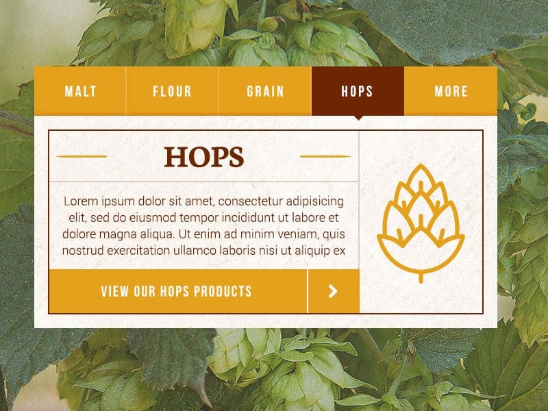
For example, in the above screenshot, the content is divided into five panels: Malt, Flour, Grain, Hops, and More.
However, you are viewing the content of the "Hops" panel only.
Because of how Tabs UI works, you can only view the content of one panel at a time.
So, if you want to view the content of another panel, let's say "Malt," you have to switch to it by clicking on its associative tab:
Credits: https://dribbble.com/shots/16206958-CSS-tabs-animation
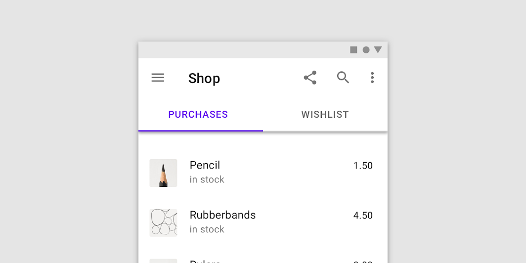
This also means that Tabs UI allows you to navigate between multiple panels, reducing clutter and fitting more content into a smaller space.
This is why Tabs UI is more widely used on mobile designs:
Now, let's understand the tabs component in a technical way so that we can implement inside the HTML, CSS, and Javascript.
Parts of a Tabs component
A "Tabs" component is divided into three parts:
1) The tab list
It shows all the available tabs that allow us to switch between different content panels.
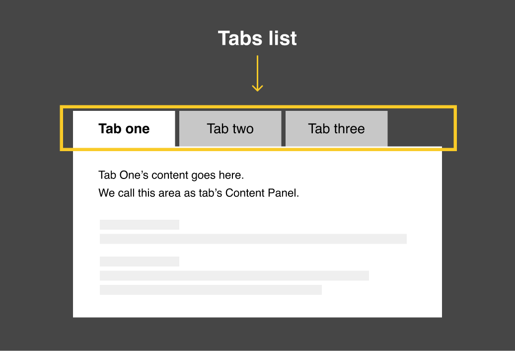
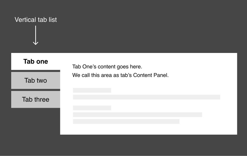
There are two types of tab lists:
- Horizontal tab list ( see above design )
- Vertical tab list
2) Individual tab and its label
Inside the tabs list, a tab is a small labeled box that can be clicked and interacted with.
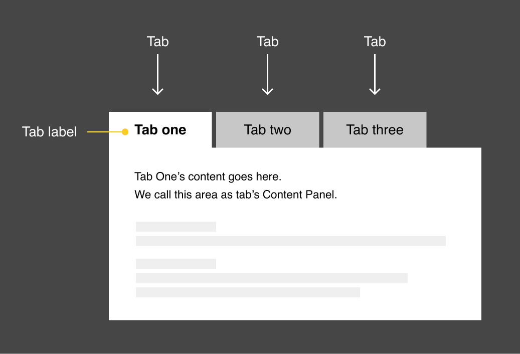
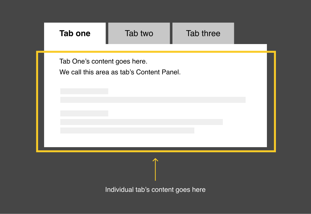
3) Tab's content panel
This is where the individual tab's content is placed.
How tabs work
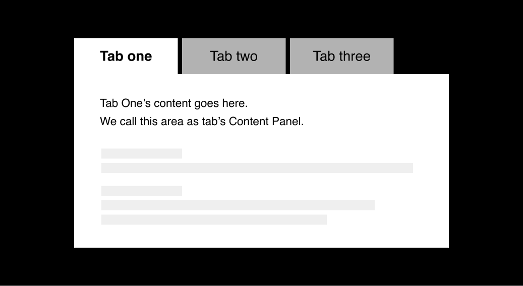
As an initial state, a tab so that its content is visible by default.
For example, in the above screenshot, the first tab labeled "Tab one" is activated so that we can see its content.
This also means that the remaining tabs will inactive and their content is hidden initially.
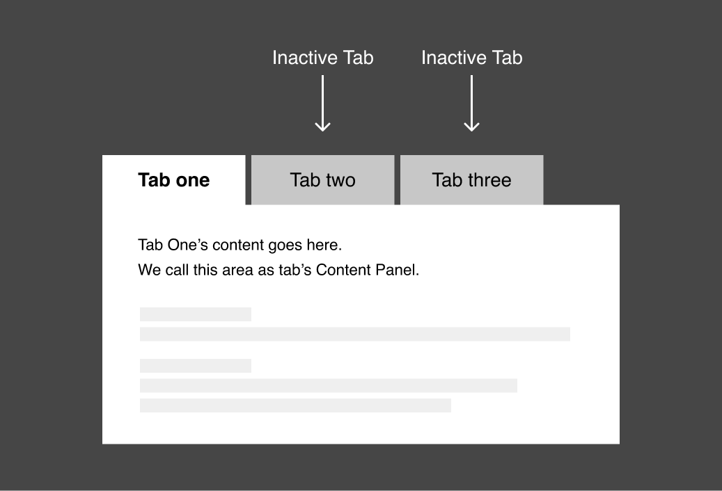
Usually, the first tab is activated so that its content panel is visible when a web page loads.
But you can break this rule by activating any tab you want as the initial state.
Next, you can switch to a different tab by clicking on it
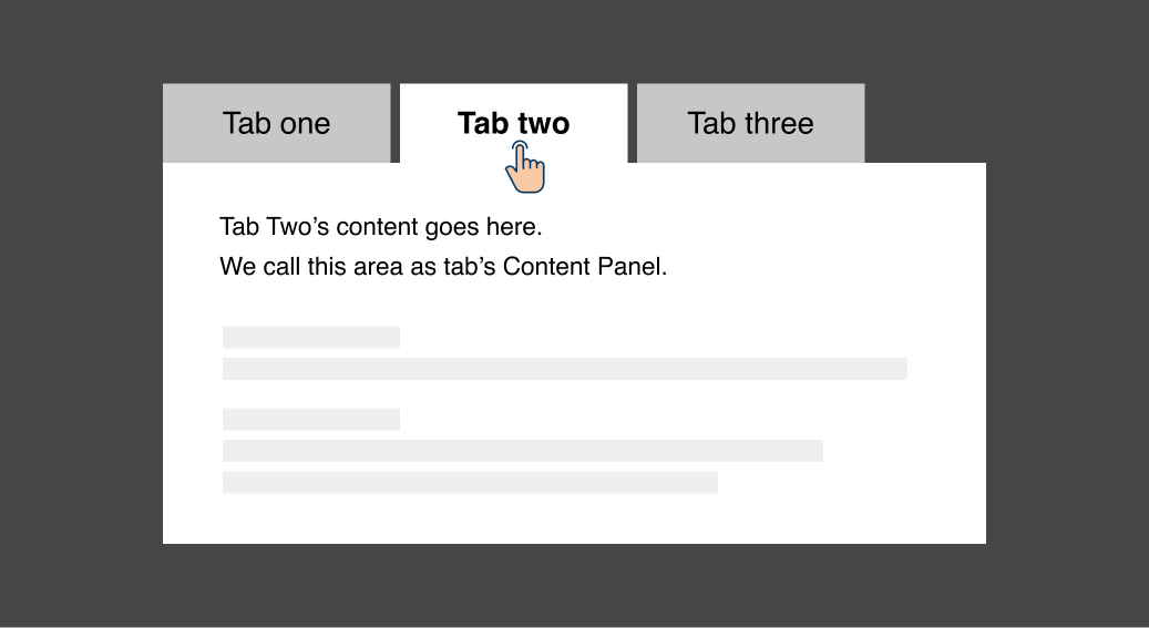
When you click on an inactive tab, its content panel will be activated, making its content visible.
We have to ensure that the active tab is easily recognizable from the ensure-active tabs.
Otherwise, it will cause a poor user experience by confusing the users.
This is why, in the above design, the activated tab is indicated with a 100% white background color, and the inactive tabs are indicated with a faded grey background color.
In the next lesson, we will set up the HTML and CSS for the tabs component, and then after that, we will write the necessary Javascript to make it interactive.