Tabbed Content: Setting up HTML and CSS

Here is what we are trying to achieve:
Come on, download the starter files and open them up inside the code editor:
Here is the basic HTML structure to achieve the tabbed content:
<div class="tabbed-content">
<div class="tab-list">
<a href="#creativity">Creativity</a>
<a href="#curiosity">Curiosity</a>
<a href="#resilience">Resilience</a>
</div>
<div class="tab-content-panels">
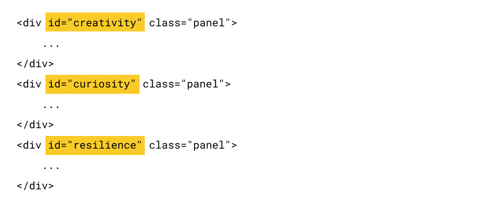
<div id="creativity" class="panel">
...
</div>
<div id="curiosity" class="panel">
...
</div>
<div id="resilience" class="panel">
...
</div>
</div>
</div>Nothing fancy.
The <div class="tabbed-content"> is the main container that represents the tabbed-content section.
To achieve tabbed content, as discussed during the previous lesson, we need to have a list of tabs and corresponding content for each tab.
1) So, the main container holds a list of tabs that users can click on to access the corresponding content panel:
<div class="tab-list">
    <a href="#creativity">Creativity</a>
    <a href="#curiosity">Curiosity</a>
    <a href="#resilience">Resilience</a>
</div>
2) Next, it contains the content panels that correspond to the individual tabs:
<div class="tab-content-panels">
    <div id="creativity" class="panel">
        ...
    </div>
    <div id="curiosity" class="panel">
        ...
    </div>
    <div id="resilience" class="panel">
        ...
    </div>
</div>
Simply put, the <div class="tab-content-panels"> section holds the actual content for each tab.
Anyway, if you now preview the index.html file inside the browser, it looks like this:
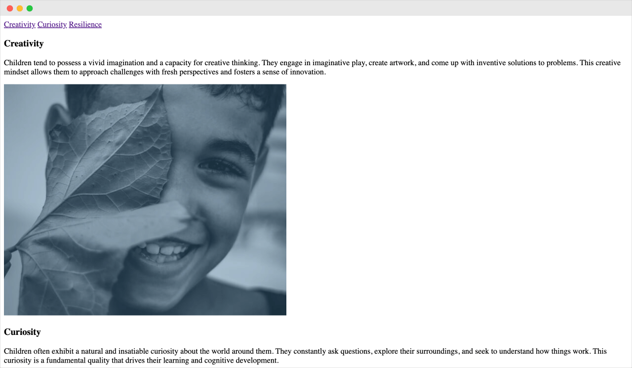
Wow! Pure bare-bones render of an HTML file 🙈
If you notice, there are three anchor links (tabs) at the top of the page:
- Creativity
- Curiosity
- Resilience
If you click on any of the tabs above, they will take you to their corresponding content section:
This is possible because:
1) Each tab's content section has a unique HTML ID:
2) And we are linking those unique IDs with the individual anchor links inside the tab list:
<div class="tab-list">
   <a href="#creativity">Creativity</a>
   <a href="#curiosity">Curiosity</a>
   <a href="#resilience">Resilience</a>
</div>
This way, when the user clicks on any tab, they will be taken to the corresponding section.
That's all we need to understand about HTML structure for now.
Now, let's style the HTML so that it looks like the tabbed content
Open up the style.css file and put the following CSS code in it:
body{
    font-family: "Inter", sans-serif;
    padding:40px 80px;
}

.tabbed-content{
    background-color: #ECECEC;
    border-radius: 28px;
    overflow: hidden;
    max-width:1100px;
    margin:0 auto;
}

/* Tab list styling */
.tab-list{
    margin:16px;
    float:left;
    height: 100%;
    background-color:white;
    border-radius: 30px;
}

.tab-list a{
    text-decoration: none;
    padding:10px;
    margin:0 10px 0 0;
    display:inline-block;
    color:black;
    text-transform: uppercase;
    letter-spacing: 0.5px;
    border-radius: 40px;
}
.tab-list a:last-child{
    margin-right:0;
}

/* Tab content panels */
.tab-content-panels{
    padding: 32px 0 0 32px;
    clear:both;
}

.tab-content-panels h3{
    font-size:48px;
    font-weight: normal;
    margin:0;
    letter-spacing: -1px;
}

.tab-content-panels p{
    font-size:18px;
    line-height: 1.44;
}

.tab-content-panels img{
    display:block;
    border-top-left-radius: 40px;
    max-width: 44%;
    align-self: flex-end;
}

.tab-content-panels .content{
    display:flex;
    gap:40px;
}

@media only screen and (max-width:1200px){
    .tab-content-panels h3{
        font-size:40px;
    }
    .tab-content-panels p{
        font-size:18px;
    }
}
@media only screen and (max-width:900px){
    body{
        font-family: "Inter", sans-serif;
        padding:40px 16px;
    }
    /* Tab list styling */
    .tab-list a{
        font-size:12px;
    }

    /* Tab content panels */
    .tab-content-panels{
        padding: 16px 0 0 16px;
        clear:both;
    }
    .tab-content-panels .content{
        gap:20px;
        flex-wrap: wrap;
        justify-content: flex-end;
    }
    .tab-content-panels h3{
        font-size:36px;
    }
    .tab-content-panels p{
        font-size:16px;
        padding-right:16px;
    }
    .tab-content-panels img{
        max-width: 50%;
    }
}
Nothing fancy going on in here, either.
The above CSS results in:
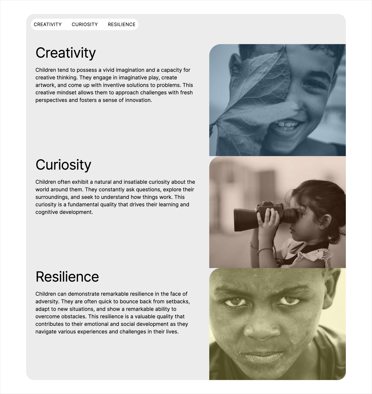
- The tab list was given a nice makeover
- Next, the individual content sections are sporting a two-column layout
- Finally, We have added some responsive styles to make the content accessible for smaller screens like tablets and mobiles.
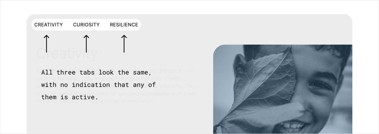
There are two problems with the above styling
If you remember how the tabbed content works:
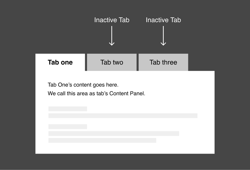
- It must have only one tab "active" at a time. The active tab must look different from the inactive tabs so that people recognize the current active tab.
- Similarly, only one tab's content panel be visible at a time. The remaining content panels must be hidden and should get revealed only when the users switch to a different tab.
But in our case:
- All three tabs look the same with no differentiation. However, the active tab must be styled differently from the inactive tab.
- All the tab content sections are visible, but only the content section related to the active tab must be visible.
We can easily fix these problems via CSS.
1) The active tab must be styled differently from the inactive tabs.
As the initial state, I want the first tab, that is, the "Creativity" tab, to look active and the remaining inactive.
We can achieve this in two easy steps:
A) Adding the class is-active to the first tab's anchor tag:
<div class="tab-list">
    <a href="#creativity" class="is-active">Creativity</a>
    <a href="#curiosity">Curiosity</a>
    <a href="#resilience">Resilience</a>
</div>
Go ahead and add it.
...
Did you?

Yep!
Great!
B) Next, style the anchor tag with is-active class it like this:
.tab-list a.is-active{
    background-color:black;
    color:white;
}
All we are doing is changing the text color and background color to make the active tab (first tab) stand out.
Come on, add the above CSS to the end of the style.css file.
If you preview the index.html file in the browser, the first tab now looks active and different from the inactive tabs:
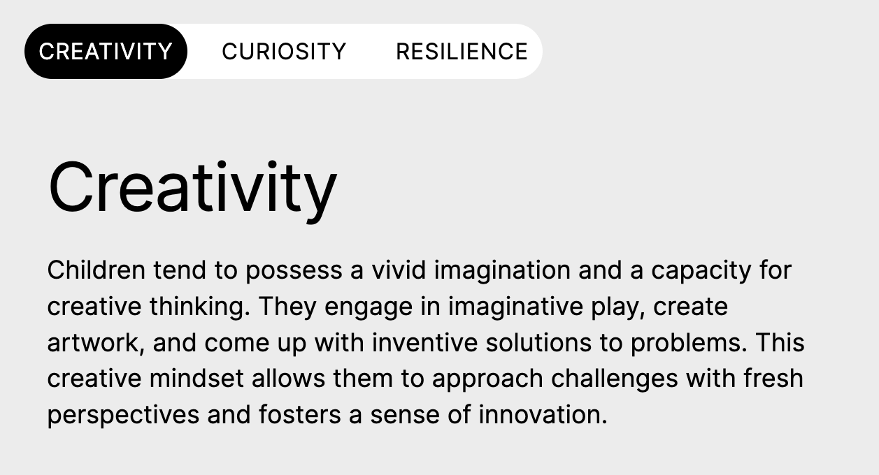
We have now fixed the first issue.
The second and last issue is...
Currently, all the tab content sections are visible, but only the content section related to the active tab must be visible.
For example, previously, we have made the "Creativity" tab active (the first tab).
So, as an initial state, the corresponding content section of the "Creativity" tab must be active while the other sections are hidden.
We can achieve this in three easy steps:
1) First, hide all the content sections, including the first tab's content section using the following CSS:
.tabbed-content .panel{
    display:none;
}
2) Next, add the is-active class to the first tab's content section:
<div class="tab-content-panels">
    <div id="creativity" class="panel is-active">
        ...
    </div>
    <div id="curiosity" class="panel">
        ...
    </div>
    <div id="resilience" class="panel">
        ...
    </div>
</div>
3) Finally, make the first tab's content section visible by using the is-active class and CSS:
.tabbed-content .panel.is-active{
    display:block;
}
This will make sure only the first tab's content is visible while others remain hidden:
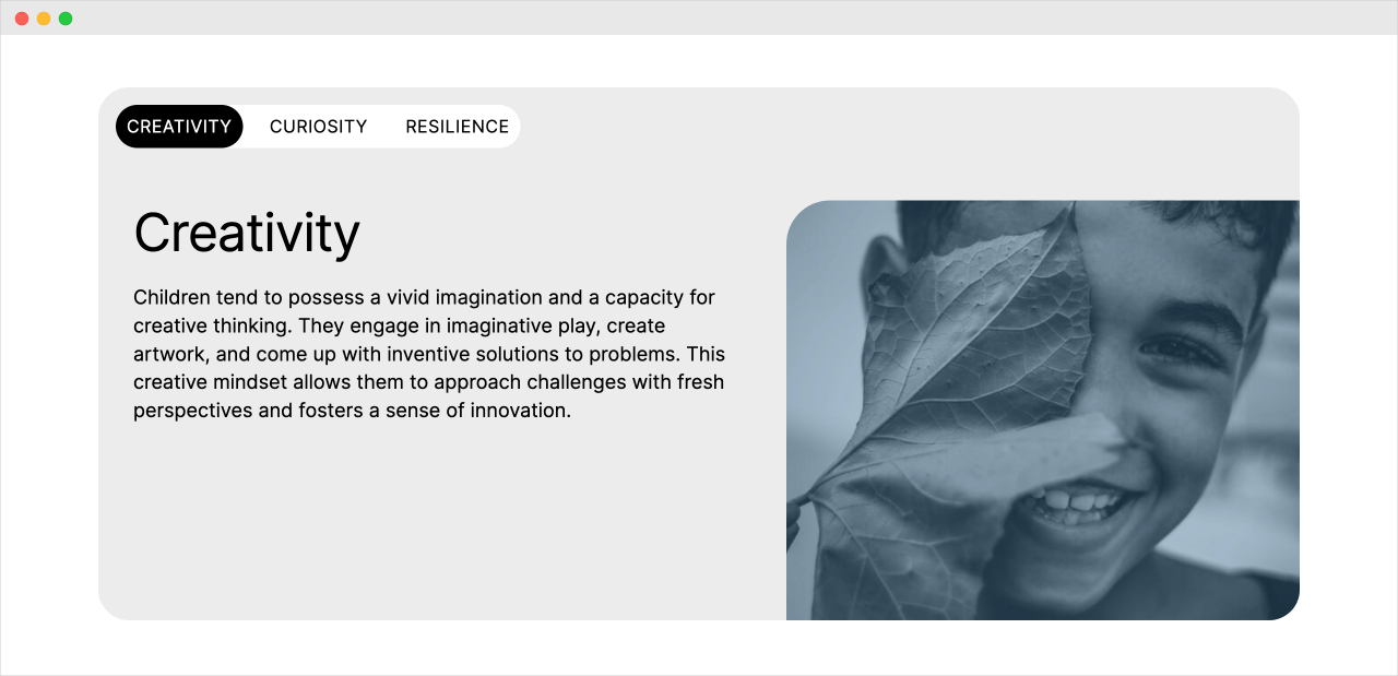
We are finally making some progress.
Switching between tabs
Now, the specially of this is-active CSS class technique is that you can switch between different tabs and their content by managing the is-active class.
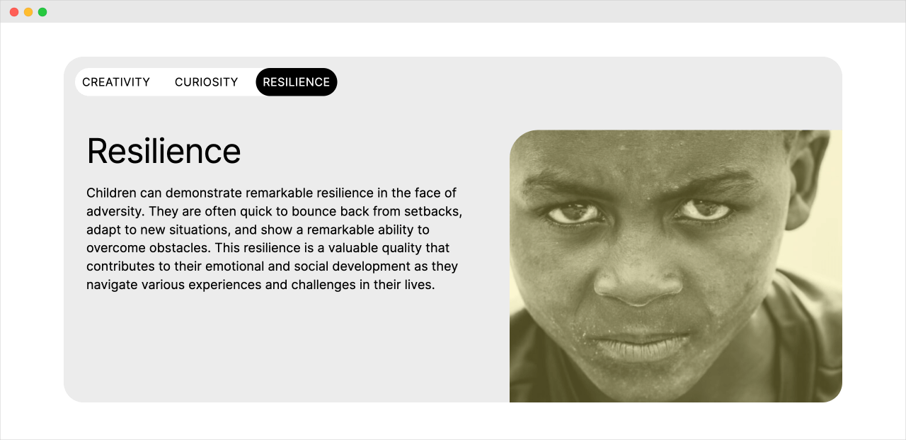
For example, if you want to make the third tab active, you can easily do it by:
- Removing the
is-activeclass from the current active tab (Creativity) and its corresponding content section - And then add the
is-activeclass to the third tab (Resilience) and its corresponding content section
<div class="tabbed-content">
    <div class="tab-list">
        <a href="#creativity">Creativity</a>
        <a href="#curiosity">Curiosity</a>
        <a href="#resilience" class="is-active">Resilience</a>
    </div>
    <div class="tab-content-panels">
        <div id="creativity" class="panel">
            ...
        </div>
        <div id="curiosity" class="panel">
            ...
        </div>
        <div id="resilience" class="panel is-active">
            ...
        </div>
    </div>
</div>
This will now activate the third tab like this:
If you want to activate the second tab, you do the same:
<div class="tabbed-content">
    <div class="tab-list">
        <a href="#creativity">Creativity</a>
        <a href="#curiosity" class="is-active">Curiosity</a>
        <a href="#resilience">Resilience</a>
    </div>
    <div class="tab-content-panels">
        <div id="creativity" class="panel">
            ...
        </div>
        <div id="curiosity" class="panel is-active">
            ...
        </div>
        <div id="resilience" class="panel">
            ...
        </div>
    </div>
</div>
Long story short, if you want to activate any tab:
- You have to remove the
is-activeclass from the currently active tab and its corresponding content - You add the
is-activeclass to the new tab and its corresponding content to activate it
But again, we shouldn't do this manually.
We should add and remove the is-active class only when the user clicks on a particular tab in order to switch to it.
And we will see how to do that in the next lesson.